
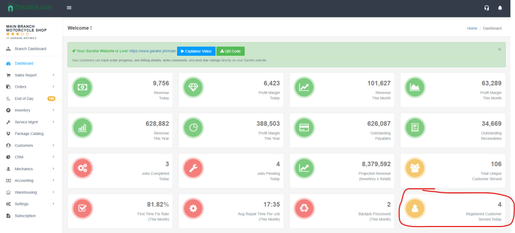
The Dashboard provides an overview of business performance, including revenue, jobs, customers, and trends.
Step-by-Step Navigation Instructions
1. Accessing the Dashboard
- In the left sidebar, find “MOTORSHOP MAIN”.
- Click “Dashboard” (dashboard icon). It will be highlighted in blue when active.
- The main content area shows “Welcome !” and your dashboard metrics.
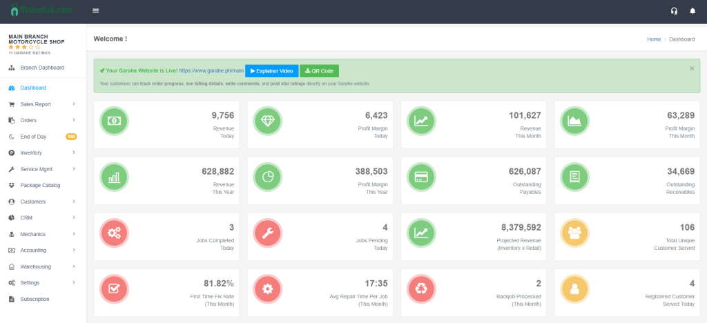
Understanding the Dashboard Layout
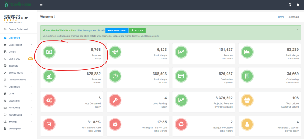
- Revenue Today
- Shows total revenue generated today
- Icon: Green circle with money bill
- Example: 0 (if no sales today)
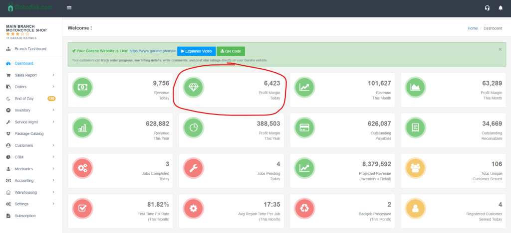
2. Profit Margin Today
- Shows profit margin for today
- Icon: Green circle with diamond
- Example: 0
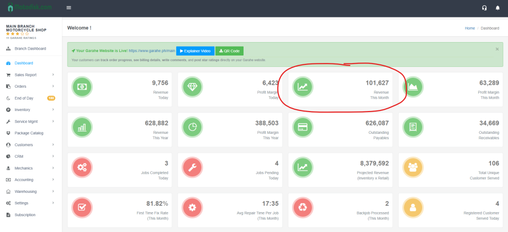
3. Revenue This Month
- Total revenue for the current month
- Icon: Green circle with upward trending line graph
- Example: 2,672
4. Profit Margin This Month
- Total profit margin for the current month
- Icon: Green circle with line graph
- Example: 1,659
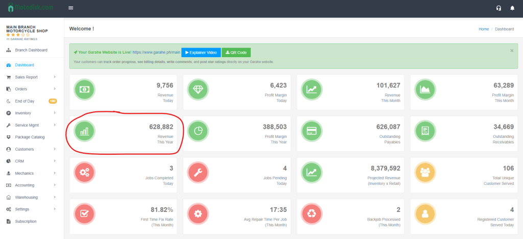
5. Revenue This Year
- Total revenue for the current year
- Icon: Green circle with bar chart
- Example: 733,845
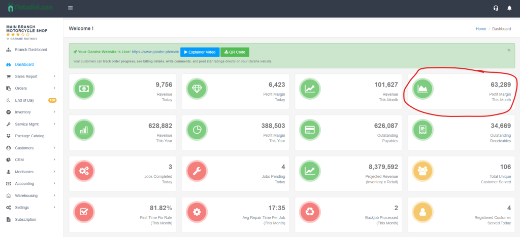
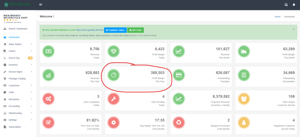
6.Profit Margin This Year
- Total profit margin for the current year
- Icon: Green circle with clock/refresh arrow
- Example: 329,358
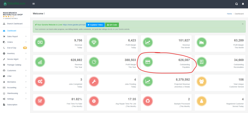
7. Outstanding Payables
- Amount owed to suppliers/vendors
- Icon: Green circle with document/bill
- Example: 21,203
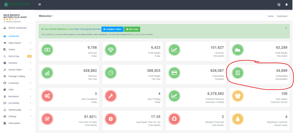
8. Outstanding Receivables
- Amount customers owe to you
- Icon: Green circle with document/bill with lines
- Example: 23,917
Row 3: Jobs & Customer Metrics
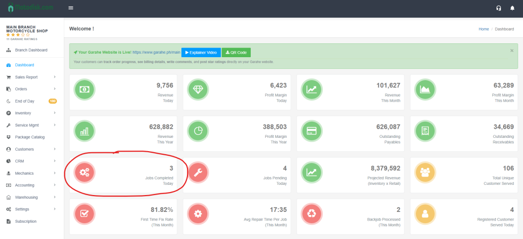
9. Jobs Completed Today
- Number of jobs finished today
- Icon: Red circle with gears
- Example: 0
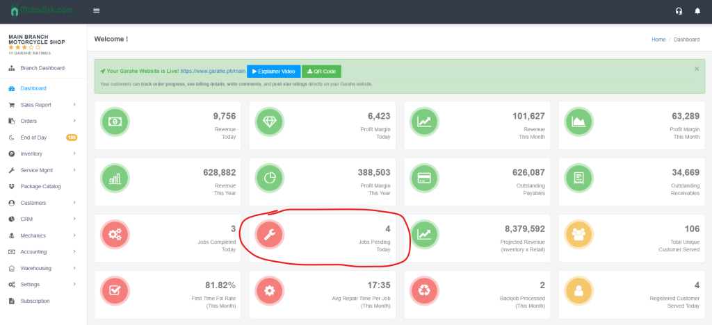
10. Jobs Pending Today
- Number of jobs still in progress
- Icon: Red circle with wrench
- Example: 9
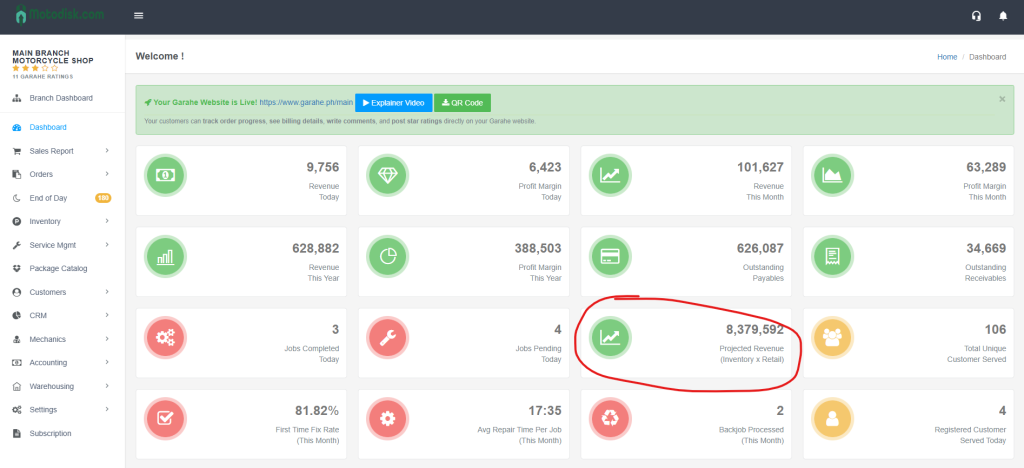
11. Projected Revenue (Inventory x Retail)
- Estimated revenue if all inventory is sold at retail price
- Icon: Green circle with upward trending line graph
- Example: 28,950,491
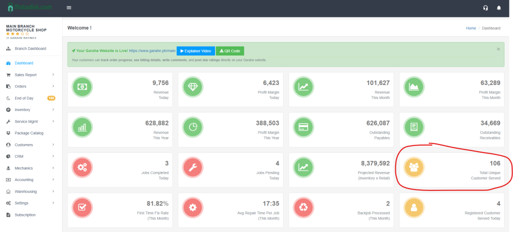
12. Total Customer Served
- Total number of customers served (all-time)
- Icon: Yellow circle with three people
- Example: 860
Row 4: Service Quality & Performance Metrics
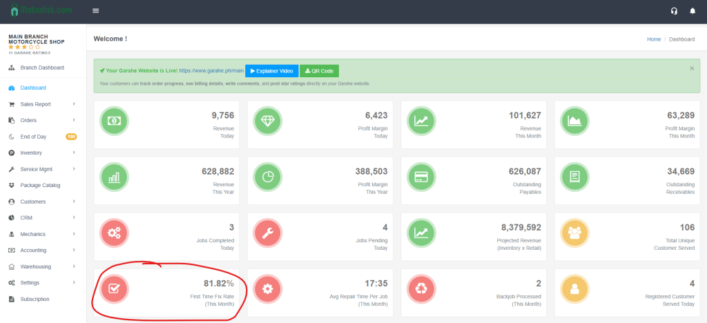
13. First Time Fix Rate (This Month)
- Percentage of jobs completed correctly on the first attempt
- Icon: Red circle with checkbox
- Example: 0.00%
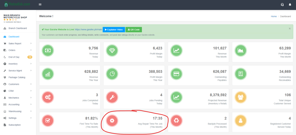
14. Avg Repair Time Per Job (This Month)
- Average time taken to complete repairs this month
- Icon: Red circle with gear
- Example: null (if no data available)
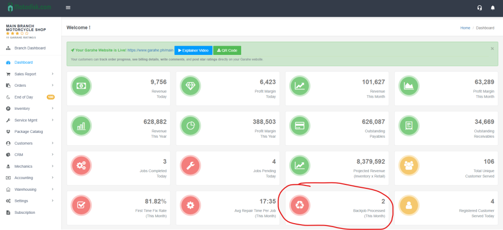
15. Backjob Processed (This Month)
- Number of jobs that needed to be redone this month
- Icon: Red circle with recycle/refresh arrows
- Example: 0
16. Customer Served Today
- Number of customers served today
- Icon: Yellow circle with single person
- Example: 0
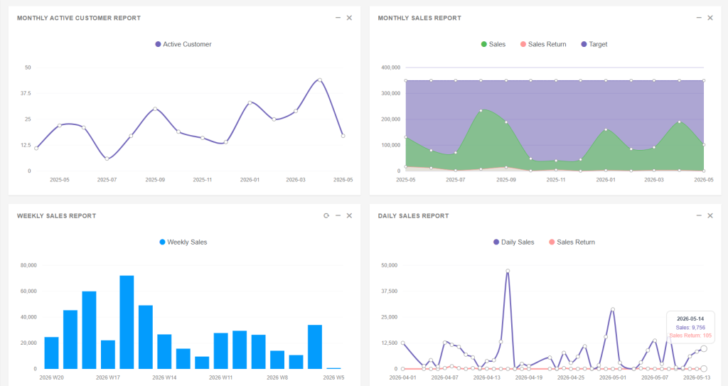
Section 2: Report Charts (Middle Section)
Four visual reports show trends and patterns:
Four visual reports show trends and patterns:
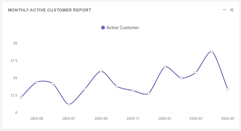
1. Monthly Active Customer Report
- Type: Line graph
- Shows: Number of active customers per month over time
- Legend: “Active Customer” (purple line)
- Y-axis: Customer count (0 to 500)
- How to Read: Track customer growth trends; peaks indicate high activity periods
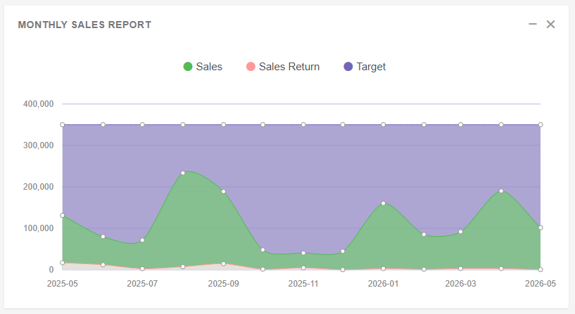
2. Monthly Sales Report
- Type: Area chart
- Shows: Sales performance over months
- Legend:
- Sales (green area)
- Sales Return (red area)
- Target (purple flat line at 300,000)
- Y-axis: Sales amount (0 to 300,000)
- How to Read: Compare actual sales against target; monitor sales returns
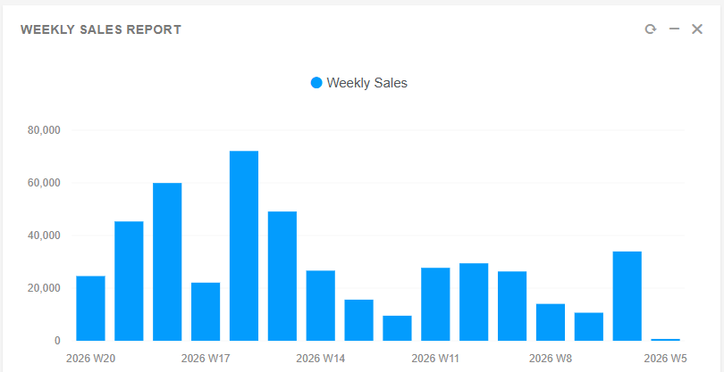
3. Weekly Sales Report
- Type: Bar chart
- Shows: Sales performance by week
- Legend: “Weekly Sales” (blue bars)
- Y-axis: Sales amount (0 to 90,000)
- How to Read: Identify high-performing weeks; bars show weekly sales volume
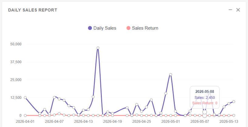
4. Daily Sales Report
- Type: Line graph
- Shows: Daily sales trends over the past month
- Legend:
- Daily Sales (purple line)
- Sales Return (red line)
- Y-axis: Sales amount (0 to 20,000)
- How to Read: Track daily performance; identify peak days and return patterns
Section 3: Performance Sections (Bottom Section)
Two tables highlight top performers:
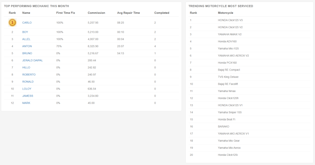
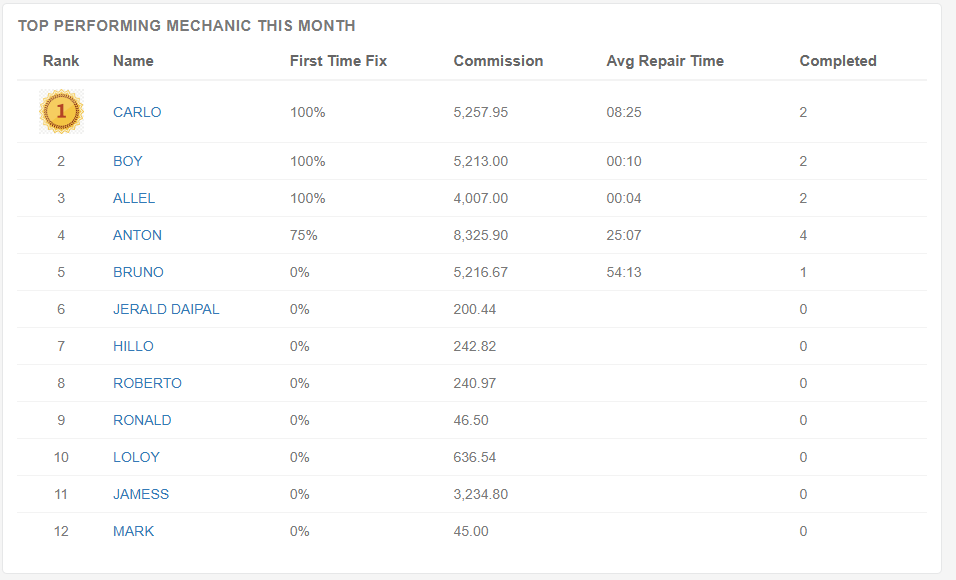
1. Top Performing Mechanic This Month
- Columns:
- Rank: Numerical ranking (1st place has gold medal icon)
- Name: Mechanic’s name
- First Time Fix: Percentage of jobs fixed correctly on first attempt
- Commission: Total commission earned this month
- Avg Repair Time: Average time per repair (may show 0 or null if no data)
- Completed: Number of jobs completed
- How to Read: Identify top performers by commission and completed jobs; use First Time Fix to assess quality
Example Data:
- Rank 1: JONIE MANLAWE – 1,022.43 Commission
- Rank 2: EDRIAN C NERWA – 713.18 Commission
- Rank 3: JAMES – 1,752.75 Commission
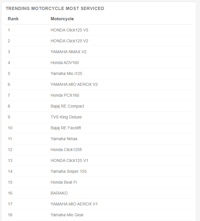
2. Trending Car Most Serviced
- Columns:
- Rank: Numerical ranking
- Car: Make and model
- How to Read: Identify most frequently serviced vehicles; useful for inventory planning and service focus
Example Data:
- Rank 1: Honda Brio
- Rank 2: Honda City
- Rank 3: Audi A5
Video Tutorial
Understanding Color Coding
- Green Icons: Revenue and profit metrics (positive indicators)
- Red Icons: Job-related metrics and service quality indicators (attention needed)
- Yellow Icons: Customer-related metrics (neutral/informational)
- Blue Highlight: Currently active/selected navigation item
Tips for Effective Dashboard Reading
1. Quick Health Check
- Check Revenue Today and Jobs Pending Today for immediate status
- Review Outstanding Payables and Receivables for cash flow
2. Performance Analysis
- Compare Revenue This Month vs Profit Margin This Month to assess profitability
- Review First Time Fix Rate to gauge service quality
- Monitor Jobs Pending Today to manage workload
3. Trend Analysis
- Use charts to spot patterns (e.g., peak sales days/weeks)
- Compare Monthly Sales Report against Target to track goals
- Watch Monthly Active Customer Report for customer retention trends
4. Performance Recognition
- Review Top Performing Mechanic This Month to recognize top performers
- Use Trending Car Most Serviced to plan inventory and service focus
5. Daily Monitoring
- Start each day by checking Revenue Today and Customer Served Today
- Monitor Jobs Completed Today vs Jobs Pending Today for workflow balance